Testing web sites in multiple versions of Internet Explorer

Ie8logo1

There’s nothing more frustrating running  a web site only to receive complaints that it “doesn’t work” in some specific version of a browser. The major culprit almost always seems to be Internet Explorer – I’ll leave the philosophical debate why this might be the case for another day.

The issue came up for me because I was messing with a little personal project the other night that uses the Bootstrap 3 framework. I tried the page in IE11, with IE8 emulation, and the pages didn’t work correctly – despite being on a full size screen, the pages were acting all ‘responsive’ on me, and rendering the mobile versions. I then read somewhere that IE8 emulation on IE11 is not accurate – pretty useful! It seems IE11 in IE8 emulation mode does not respect conditional statements – which was what was messing with my responsive design. It was not handling the media queries include that’s needed to correctly render modern CSS in an IE8 browser.

Of course the problem here is I don’t have IE8 on a real machine available to me anywhere.

However, help is at hand, with thanks to Microsoft, which has now made available pre-packaged virtual machines for many combinations of Internet Explorer and Windows OS.

Providing you have one of the virtual machine software setups, for example Virtual PC on Windows or Parallels on Mac you are in business. I use Parallels and here are the VM configurations available to me – it’s pretty wide, there’s even IE6 on XP, but also IE8, IE9, IE10 and IE11 on Windows OS  including Vista, Windows 7 and Windows 8.

Screen Shot 2014-03-07 at 8.03.59 AM

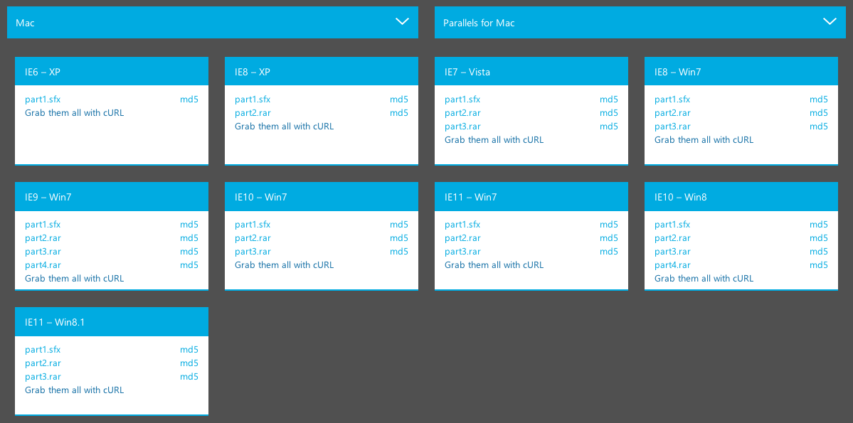
Downloading and setting up the VMs is a snap, within a few minutes I had a fully functional version of IE8 running on Windows 7 in a window on my Mac – and 10 minutes after that had diagnosed the problem with my web site and applied a fix. Note, if you are using Parallels on Mac there is some helpful information on the Parallels web site about configuring the VMs, starting with the fact the file you download has the wrong file extension – you need to manually update the file name before Parallels will recognise it as a VM.

Now Internet Explorer won’t even confess to being Internet Explorer

liar

The bizarre world of Internet Explorer never ceases to amaze me. Today’s revelation – Internet Explorer 11 doesn’t even like to admit that it’s Internet Explorer.

When a web browser visits a web site, it identifies itself to the web site with a string of information that contains various elements that say to the web site “hey, I’m here, this is the type of web browser I am, my version, operating system”. It’s known as the user-agent string.

In the past the user-agent string for Internet Explorer would look something like this:

Mozilla/5.0 (compatible; MSIE 9.0; Windows NT 6.1; Trident/5.0)

The ‘MSIE’ stands for Microsoft Internet Explorer, so pretty easy to work out which browser is visiting your web site.

Today I was wondering why I could not teach some web site code to recognise it was being visited by IE, did a little research and came up with this page of explanation from Microsoft.

Mozilla/5.0 (Windows NT 6.1; Trident/7.0; rv:11.0) like Gecko

What’s missing? The ‘MSIE’ of course!

If I was using Firefox, the string would say FIREFOX, like this:

MOZILLA/5.0 (MACINTOSH; INTEL MAC OS X 10.8; RV:26.0) GECKO/20100101 FIREFOX/26.0

Safari would say ‘SAFARI’, and Chrome would, well now there’s the rub, because Chrome can say CHROME as well as SAFARI:

MOZILLA/5.0 (MACINTOSH; INTEL MAC OS X 10_8_5) APPLEWEBKIT/537.36 (KHTML, LIKE GECKO) CHROME/32.0.1700.77 SAFARI/537.36

Remind me again why I got into this web development malarky?

word-wrap: break-word CSS for long text options in drop down select lists

CSS+HTML

A quirk I ran across yesterday with CSS on a drop down list. The list is disabled and has a width fixed with CSS and is contained in a table cell. The selected option text is wider than the fixed width of the list.

<table class="grid_table_new">
  <tbody>
    <tr>
      <td><select style="width:130px;" disabled="disabled" >
          <option value="47" selected="selected">Traditur Preascep irruit. Sed now possum Non adamare te. Maneam</option>
        </select></td>
    </tr>
</table>

When viewed in the browser the list looks like as you would expect:

Screen Shot 2013-12-21 at 8.55.42 AM

Except someone showed me their screen, and it looked different:

Screen Shot 2013-12-21 at 9.00.08 AM

As you can see, the drop down has expanded vertically to display the entirety of the option text. I tested this page in a bunch of browsers and found this  was only happening in a couple of browsers:

  • Chrome (Win) – YES
  • FF (Win) – no
  • Safari (Win) – YES
  • IE11 – no
  • Chrome (Mac) – no
  • FF (Mac) – no
  • Safari (Mac) – no

After a significant amount of poking around in a large amount of CSS I finally tracked it down to this piece of CSS:

table.grid_table_new td, table.grid_table_new th {
	word-wrap: break-word;
}

word-wrap has been around for a while but from what I can tell is not officially applicable to options in a select list, it’s designed to help when formatting blocks of text on a page, and has now been renamed to overflow-wrap, which now seems to be supported by current browsers. I tried swapping the existing property to overflow-wrap – same outcomes though.

It seems this is a quirk of Chrome and Safari on Windows (note, NOT on Mac). And given it’s impossible to specific that my customers should use one of those browsers clearly we need an alternative solution to cope with these long text options. Thankfully JQuery gives us choices, such as this plugin.